
10 Required Elements of Modern Web Design
The ten design elements every modern website needs to turn visitors into customers — from responsive layouts and brand colors to a clear call to action.
4 min read
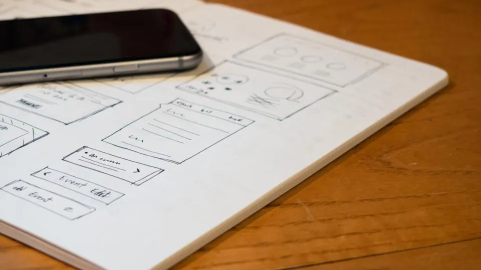
Originally published August 7, 2019 on the original SPEN10 blog. Lightly refreshed in October 2026: fixed formatting, replaced dead links, and added a few notes where things have changed.
More and more people are going online every day, on more devices of more sizes than ever. The best way to reach most of your potential customers is with modern web design: a website that's easy to navigate, where visitors can find exactly what they need — turning more visitors into customers.
Here are the elements I recommend for a modern website that turns visitors into customers instead of turning them away.
1. Mobile friendly
Also known as responsive design. With people browsing on phones, tablets, laptops and giant monitors, this one is essential. A responsive page automatically adjusts its layout to the size of the screen, so every visitor on every device gets a great experience.
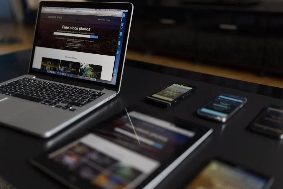
2026 note: most of your visitors are now likely on their phones, so design for mobile first and scale up.
Learn more about responsive design (MDN)
2. Brand colors
Modern web design uses no more than two main colors to represent your brand.
If you need more colors, use different shades of your main colors where possible. It never hurts to add neutral colors (white, black, gray) where they make sense. Using color well speaks to your ideal customer and makes your website look professional — which builds trust.
Beginner's guide to choosing brand colors
3. Consistent fonts
Pick two main fonts: one for headlines and one for body text, and use them on every page and in all your branding. You can throw in a third "special" font for accents (I like a marker-style font for signatures). The fonts should contrast each other to make your site pop — for example, a serif for headlines and a sans-serif for body text.
4. Minimal design
Most web users don't like to read much. When a visitor lands on your website, they want the most important information first. The more relevant it is to what they're looking for, the higher your chance of converting them. Visitors should see exactly what you're all about the moment they land on your page.
5. A clear message
When a potential customer lands on your home page, they should immediately see a clear, easy-to-read message about exactly what your website is for. Keep the messaging relevant throughout the site, with contrasting colors and readable fonts so visitors understand it at a glance.
Creating a clear message (video)
6. User interface
Your layout should be clear, with the menu options you most want people to click shown first. Pages should be easy to follow, and your menus and navigation should work flawlessly. It's also very important that there are no broken links or menu items.
7. SEO
Search engine optimization is an ongoing effort, and it usually takes a while before you see noticeable results. On-page SEO can be done when a page is built: you research the keywords people search for and place them naturally in the most important parts of the page, like the title and headings.
8. High-quality images
Images should be high quality, but not oversized. Compress them before uploading so the file size is as small as possible — every little bit helps your site's loading speed.
2026 note: modern formats like WebP and AVIF make images much smaller at the same quality, and most site builders and frameworks now convert and resize images for you.
Learn about optimizing images (web.dev)
9. White space
White space isn't always white — it just means areas of the page with no text, images or other content. White space separates sections and creates a nice, easy-to-follow flow. When everything is cramped together, it's hard to read, and most readers won't try to make sense of it for long.
10. A clear call to action
If you're selling a product or service, or want visitors to take another action (like joining your email list or sharing on social media), give them a clear call to action. Put it at the end of your sales message or page, but don't be afraid to repeat it — near the top and in the middle works too.
Thanks for reading!
— Spencer
Share this post
Found this useful?
Get the next one in your inbox. No spam, unsubscribe anytime.